Jokerman - A Typeface Worse Than Comic Sans?
Jokerman - A Typeface Worse Than Comic Sans?
Jokerman - A Typeface Worse Than Comic Sans?
Comic Sans gets a lot of hate - maybe for the right reasons, but there's this typeface that sucks so hard, it never enters conversations.
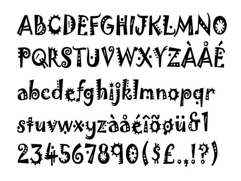
Jokerman is not a typeface a lot of people outside design are familiar with, which seem fair, because not a lot of designers ever bother with the font. Developed by British designer Andrew K. Smith in 1955, Jokerman is a decorative font with its own personality - which may not be a good one. It is quite possible that shortly after it was developed,
If you assume Jokerman's irrelevance is only recent, you may be wrong. The typeface has not enjoyed a lot of support or commercial attention since its creation. Its original use was in mediums where humour was needed, but even this was limited, as there were a lot of other better fonts that did not look like something out of a fever dream.
These days, only amateurs who are interested in making their design pop, the wrong way, ever bother with Jokerman.
Typeface